Tuesday, 20 January 2015

Challenges Facing the Media Industry

Challenges Facing the Industry;


Some of the challenges that the media industry include; having to adapt to the new technological age in which communication has changed dramatically. They are having to survive in a world in which paid media strategies have been replaced by a combination of paid, owned and earned media. Moreover another challenge that the industry as a whole faces is trying to find new interesting news to present to their audiences. The internet is often so up to date that, by the time many magazines have been published, more up to date news has already been released. As a result of this many magazines have had to set up online websites in a bid to keep their readership loyal and feed them the most recent news possible. Overall the main challenge to the media industry in modern times is the internet and having to adapt around the internet in order to keep attracting readers.


Sunday, 18 January 2015

Class Notes; Representations of Age & Sexuality

Representation of Age in Media
How is Age represented in these Clips?
1)      Accused; Teenager. Fits in with the criminal, violent, drugs, lazy, liar, rebellious & outlandish stereotypes.
-          Shown as weak & pathetic.
2)      Barrister; Middle Aged. Fits in with the in control, sensible, mature & aggressive stereotypes.
3)      Barrister; 20-30’s, has a softer approach.
Age Stereotypes in the Media;
1)      Children; young, innocent, naïve, pure, sweet, helpless & powerless.
2)      Teenagers; aggressive, moody, lazy, criminals & hate school.
3)      20-30’s; parties, fun, making money, glamorous & attractive.
4)      Middle Aged; past it, unattractive, uncool, boring, dominant over others & grumpy.
5)      Elderly; unattractive, slow, weak, ill, confused, pathetic, powerless, not important, dependant on others.
Sexuality;
Stereotypes;
1)    Heterosexual Male; tough, protector & a leader, higher in society, dominant figures of state, in their 40’s & in high paying jobs.
2)    Heterosexual Female; weak, girly, feminine, damsel-like & emotional, subordinate figures.
Stereotypes about homosexuals;
1)      All gay men will die of AID’s.
2)      All gay men are feminine.
3)      All gay women are butch.
4)      Gay men can’t marry nor have children.
5)      Homosexual Male; camp, girly, promiscuous, feminine looking clothes & loud.
6)      Homosexual Female; Butch, feminist, short hair & hate men.

-          Heterosexuals; monogamous, the ‘norm’, straight couples have kids etc.
-          Stereotypes are used in TV because they give people broad views of people’s sexuality.
-          They are used to make TV more interesting & are most likely found in the genre of TV dramas.
-          60’s- gay was banned so men had to cover up their homosexuality.
-          In the 50’s homosexuals were sent to asylums to be ‘cured’ of their homosexuality as it was considered a disease.


Tuesday, 6 January 2015

Music Magazine Front Cover Analysis


Music Magazine Front Cover Analysis
Cover Model/Central Image;
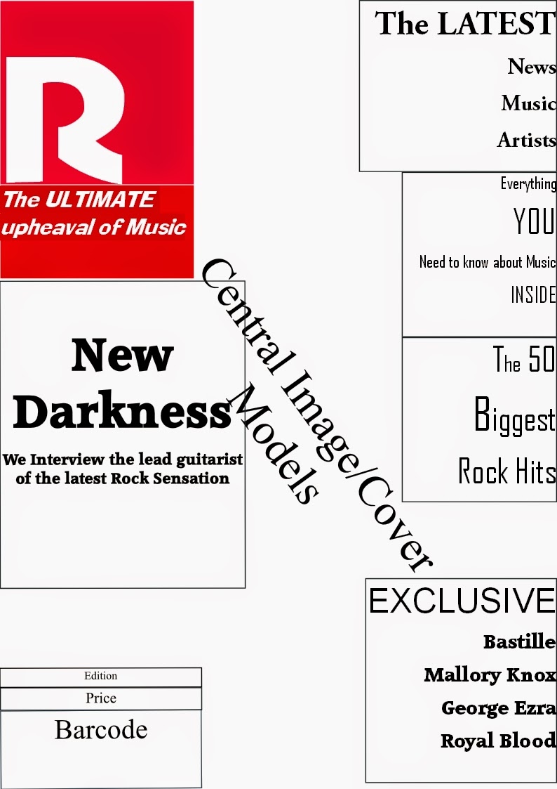
For my front cover I decided to use a darker, striking image because I wanted to attract the reader’s attention straight away and also having a darker image allows the text to stand out clearer, it also links with the darker theme of rock music. The image is the first thing a person looks at on the cover and I wanted to make sure mine was eye catching enough for them to pick up the magazine.
Colour Scheme;
The colour scheme that I used for my cover was a mixture of white and red. I chose this colour scheme because I thought that they combined well together to make the text stand out clearer and be more effective at catching the eye. I put the masthead in a bold red because I wanted the house name to stand out and be one of the first things the reader notices, this not only informs them what magazine it is but it is more likely to stay in their head.
Additionally I made key words such as “Exclusive, You, Latest” stand out as these are the words that sell the cover lines to the audience. I want them to be drawn in by an ‘exclusive interview’ so that they read further into the magazine.
Font;
On the cover of my magazine I included different font sizes and colours. I did this because I wanted to add variety to the cover and I did not want it to become repetitive in its style. For example I increased the font size of the Masthead, Anchorage and key words in the Cover lines, I did this because I wanted these words and letters to stand out from the page and catch the reader’s eye. I also changed the colour of the letters at the start of the artist’s names; I wanted to do this because it makes the cover line appear more important than it may appear at first. Also I felt that it added some variety to the text rather than having one block colour all the way through.

Lifestyle Questionnaire Results


Lifestyle Questionnaire Results
I asked 3 people to carry out my lifestyle questionnaire, two girls and one boy and these were the results;
-       2/3 people said they bought music from ITunes.
-         2/3 said that they listened to music on the go.
-         2/3 stated Rock was their main genre of music.
-         2/3 listens to Rock music regularly.
-         2/3 said they go to between 6-10 Rock concerts per year.
-         Most of the participants buy music weekly.
-         Most of the people listen to daily to music for 4-6 hours.
-         2/3 people have 1000+ songs on their iPod/music player.
-         Most of them invest in good quality headphones.
-         All of them thought the magazine’s cover photo was great.
-         All of the people stated the colour scheme of the cover was great.
-         2/3 thought the price of the magazine was not expensive.

 All in all I am very happy with the feedback I have received from the questionnaire. I now know that the cover model I have used for my front cover is very effective and that the colour scheme that I am using combines well with the image. The answers also indicate that my cover is appropriate for my target audience and that all of the people taking part in the questionnaire fit in with my ideal reader.

Saturday, 3 January 2015

How Magazines Make Money & the Structural Triangle

How Magazines Make MoneyPublishers of magazines earn money from advertisements, subscriptions & the sales generated from newsstands. This is an easy feat for magazines that are known household names. Publications such as "Essence" "Vanity Fair" & "People" have loyal readers because the producers listen to the wants of their audience. Having a good product created their place in the market. These magazines often tell the same story but they are written in such a way that their readers believe they have the insight that the internet or others may not have which keeps their audience coming back for more. The internet has hindered magazine sales but the bigger magazines have adapted and now have websites that work in conjunction with their magazine and offer incentives for purchasing a subscription. Magazines are very expensive to produce, the survival rate is one for every 10 magazines and profits do no turn over for about 3 years.

The Structural TriangleFor my research i looked at two interpretations of the Structural Triangle; one being Maslow's Hierarchy of Needs and the second being the Triangle of Oppression.
Maslow's Hierarchy of Needs;
Maslow wanted to understand what motivates people, he believed that people possess a set of motivation systems unrelated to rewards or unconscious desires. He stated people are motivated to achieve certain needs, when we fulfill each one we move on and seek the next one. When these needs are unmet the desire to fulfill them becomes stronger the longer they are unmet i.e the longer someone goes without food the hungrier they become. We must satisfy  the lower basic needs before moving on. Every person has the capability to move up the hierarchy however that progress is often paused by failures such as divorce, loss of a job. These may cause people to fluctuate between levels of the hierarchy.
The Triangle of Oppression;
The Triangle of Oppression enables us to examine our attitudes beliefs and behaviors within a
social context rather than as merely individuals. Those people who do examine their attitudes
beliefs and behaviors in this context are referred to as "allies" in social justice processes.

Anne Bishop, a Canadian educator and.social justice activist, defines allies as people who;
- are personally culturally and structurally aware;
- are connected with.all other people rather than with only their own social groups and not only in a professional or service capacity.
- have a critical analysis of social structures.
- possess a collective orientation as opposed to one that is individualistic.
- have an acceptance of struggle and a sense of process.
- have an understanding of power with as opposed to power over and
 have a high degree of self understanding, a knowledge.of history and an understanding
that good intentions do not matter if there is no action against oppression.

As allies to social justice we are dealing with complex personal interaction that is shaped
consciously and unconsciously by cultural norms and structural systems.The Triangle of
Oppression gives us a way to begin engaging ourselves in a social justice.processes.
The Triangle of Oppression enables us to think more critically about the powerful ideas about
difference that exist in society, and that are used to exploit those differences within the systems
of society.


DPS Inspiration

Q's DPS i really like because of the way they have used colour and font to sculpt the DPS. The colour's are both striking and eye catching and make the text and image stand out. I particularly like the use of the Large Capital J behind the text as it not only links with the artist but also makes a seemingly blank page bright and captivating. I plan to use something similar to this to make my own text stand out as i think the use of it is very good and i think it adds something different to my magazine. 
This DPS has inspired me because of the way it combines a number of images with a large amount of text to great effect,
the pictures do not take up too much room and seem to perfectly compliment the text. The font used for the titles is also very good as it is both very clear and eye catching at the same time. The images seem to surround the text which is unusual, what is also unusual is the amount of images used. Normally this would be too many images but in this particular case i think it works very well as it gives a very personal touch to the article, we are allowed to get up close to the two members of Twin Atlantic which works very well. I think i will use this DPS as my main inspiration as i want to create something outside the box for my DPS and i want to incorporate how the magazine has used a large number of pictures but has not cut down on the amount of text. I think it is a good DPS to use as an inspiration for my magazine.


Magazine Rate Card; Inspirations