Monday, 30 March 2015
Final
During the designing of my various pages i have diverted from the original designs that were drawn up in my plans. I did this because i decided to create something completely different to my plans and i felt that when i was designing my plans i did not take into consideration the position of key parts of the pages such as the masthead, cover lines and captions. This is why my plans look slightly different to my finished products. Also some of the images look different from the photo selections as i went back and did some final editing changes to improve the look of them and make sure they worked well with the other features of my pages
Content's Page; Photo selection process
The selection process;
The photos that I could choose from are all similar but are taken from a variety of camera angles. As you can see the final photos have been edited to make them look as good as possible.
.JPG)
Image 1;
I decided not to use this image as I did not think it would portray the media message that I want across to the viewers. As well as this I thought that even after editing that the image was still not good enough. I did not want to use black and white on my contents page as I wanted to make it as striking as possible.
.JPG)
Image 2;
I did not select this image to use because I thought that some of the details were a bit blurred. Although the image is colourful and striking I just felt that it wouldn't look good on my contents page and that is why I decided not to use it.
.JPG)
Image 3;
I was tempted to use this particular image for my contents page but I decided not to use it because as with the image before I did not think the colours would combine well with my house style. It is a good detailed picture but with the colours and text I am using I just thought it wouldn't combine well with them.
.JPG)
Image 4;
I used this image for my contents page because I thought the colours combined really well with each other to create a striking image that I feel would attract my target audiences attention. It fits in well with the colours of my house style and the array of text that I will be using. This picture ticks all the boxes for me.
 Image 5;
I decided to use this image becasuse i found it striking and thought that it would link well with my rock theme. The model is very the appropriate clothing and has the correct facial expressions and posture that i needed. I also feel this image would combine well with my text and the other images that i will use.


Image 6;
I decided to chose this image because i wanted to add some variety to my contents page and i realized i had no female models on any of my pages. I found the facial expression used by the model striking and thought that it would attract the attention of the reader.
Image 7
Finally i chose this image because i thought that it looked good, linked well with my theme and was edited appropriately. The model again followed the directions i gave him to the book and created an image that i thought was perfect and combined well with my 'house style'
The photos that I could choose from are all similar but are taken from a variety of camera angles. As you can see the final photos have been edited to make them look as good as possible.
Image 1;
I decided not to use this image as I did not think it would portray the media message that I want across to the viewers. As well as this I thought that even after editing that the image was still not good enough. I did not want to use black and white on my contents page as I wanted to make it as striking as possible.
Image 2;
I did not select this image to use because I thought that some of the details were a bit blurred. Although the image is colourful and striking I just felt that it wouldn't look good on my contents page and that is why I decided not to use it.
Image 3;
I was tempted to use this particular image for my contents page but I decided not to use it because as with the image before I did not think the colours would combine well with my house style. It is a good detailed picture but with the colours and text I am using I just thought it wouldn't combine well with them.
Image 4;
I used this image for my contents page because I thought the colours combined really well with each other to create a striking image that I feel would attract my target audiences attention. It fits in well with the colours of my house style and the array of text that I will be using. This picture ticks all the boxes for me.
I decided to use this image becasuse i found it striking and thought that it would link well with my rock theme. The model is very the appropriate clothing and has the correct facial expressions and posture that i needed. I also feel this image would combine well with my text and the other images that i will use.
Image 6;
I decided to chose this image because i wanted to add some variety to my contents page and i realized i had no female models on any of my pages. I found the facial expression used by the model striking and thought that it would attract the attention of the reader.
Image 7
Finally i chose this image because i thought that it looked good, linked well with my theme and was edited appropriately. The model again followed the directions i gave him to the book and created an image that i thought was perfect and combined well with my 'house style'


Sunday, 29 March 2015
Contents Page Inspiration


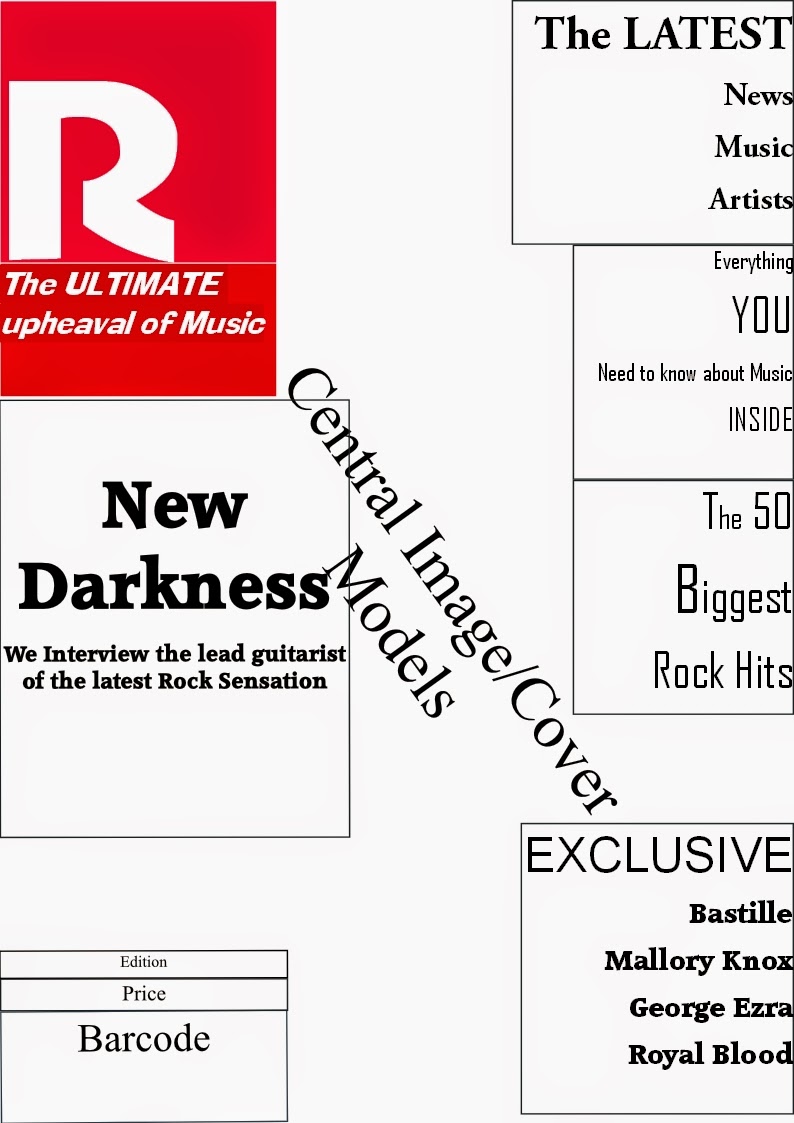
I have used these three contents pages as inspiration because i have never designed a contents page before and i wanted to know the rough layout that was needed when it came to creating one. I really like the different and unique colour schemes used by each of the three magazines as they create a "house style" and make each one different from each other. I plan to use something similar for my contents page so that the readers know that it is a content page unique to revolution. As well as this the layout of the magazines is also very effective at getting the message that the magazine wants across to the audience. I especially liked the way that each of the magazines has not just dumped their articles and page numbers in one singular column but have chosen instead to break it up into a number of sections. I really like this idea and will definitely use it for my contents page to make it look as professional as possible. I think it is important to make key artists stand out so that they are noticed first and i will also use this idea to promote some of my new and upcoming artists and make sure they get the publicity that they deserve/need. These three designs have certainly given me a lot of ideas that i can use when i am designing my contents page and will hopefully make it stand out and be unique from the rest.

Saturday, 28 March 2015
Thursday, 26 March 2015
Tuesday, 24 March 2015
Monday, 23 March 2015
Evaluation Question 2
How does your media product represent particular social groups?
For my magazine i have chosen a social group who both listen to the classic rock music style but who also like to investigate into lesser known bands that might not appear in the charts. I have targeted a generation/age group who are interested in regularly going to music festivals, gigs and constantly socializing with their friends about the latest music and tours. I have featured well known rock bands in my magazine such as; The Proclaimers, Queen and Mallory Knox so that my target audience has artists they can relate to and those who's music they enjoy listening to. However i also decided to promote new, upcoming bands that are not as well known to my social group. This is why on my front cover i promoted a new band called "New Darkness" I did this to try and expand my target groups knowledge and understanding of the genre. This will hopefully intrigue the social group i have targeted and persuade them to listen and relate to artist that previously they would not have before.
Seeing as my social group are sophisticated, reasonably wealthy and have a lot of spare time on their hands i included; more cover lines on my front cover (to show that more detail is included in the magazine) longer articles (to get the extra detail that justifies the price) and a more sophisticated font style (to reflect the higher social status of my target audience) I have also used the same colour scheme throughout to create a unique house style and because i thought it was eye catching and attract my target audience. I have tried to keep everything as well ordered as possible with a clear layout to everything. I did this because my target audience/social group are of a higher caliber in society and i needed to reflect that, my audience are not going to want a lot of pictures with very little informative text they are going to want the opposite and that is why i have incorporated so many cover lines and full length articles in my front cover and contents page. As well as this for my contents page i included as many interesting articles and artists as possible so that there would be a lot of variety for my target group to choose from. This is also why my magazine is longer (170 pages) so that i could provide as much in-depth information that my target audience would require for the price (£5.99)
The main characteristics of my social group are that they like to listen to rock music both upcoming and chart music. I decided to target both so that there would be something for supporters of either option. I think it is good to have a variety that they can choose from which also makes my magazine appeal to them because it offers something different.
The images that i used to attract my social group to my magazine are relevant to the genre of music they are interested in and are eye-catching enough to make them want to pick up the magazine and buy it. The images i have used promote new rock bands, this makes it clear to the reader what my magazine is about; informing them about new bands and deepening their knowledge of music but also if they are interested in chart music they can do that also. The main cover image is extremely eye-catching and the caption invites the reader to get exclusive information that they would not get elsewhere; this also makes my magazine appeal to my social group due to it offering something unique to "Revolution" All the models that i have used look the part and convey the messages i want them to, hopefully this gives the magazine a look of quality and originality that appeals to my target audience.
In conclusion to this i have spent a great deal of thought about how my magazine represents my targeted social group. I have shown this through; my colour scheme, connotations, magazine analysis, use of images and the content that i have provided for my target audience. My lifestyle questionnaire helped to define exactly what my target social group wants from a magazine and i have done my best to 'tick all of the boxes' and to correctly represent them in my magazine.
Tuesday, 10 March 2015
Contents Page Photoshoot Planning
Planning;
Location;
The location for my photo-shoot was an urban environment, I wanted to continue with the pattern of artists from the streets. I wanted a run down area that would reflect this and add an atmosphere to the photos. I will take photos from a number of different angles to get a variety of shots. The location will play a key part in my photo-shoot as it sets the mood for the photos.
Body Language;
As with the other photo-shoots the body language used by the models will be imposing and serious. I wanted this posture because it links in with the darker theme of rock and the aura that that specific genre of music creates. The models will either stand with their arms crossed or lean against an object as well as this the camera angles that i will use will be low angle and eye level. I am using low angles to reflect the position of authority and power that the artists have over the reader.
Facial Expressions;
The models facial expressions will stay blank and expressionless. I wanted them to be emotionless because a blank face makes them look more serious and more imposing. The facial expression used by the model is very important as it helps create the image that I want.
.
Weather;
The weather will not play a major part in the photo-shoot as it will take place under shelter. Preferably I would want the sun to be shining so that I can create a good light contrast when I am editing the photos.
Other;
The photos will be taken using a standard 16 megapixel digital camera and the final images will be edited.
Monday, 9 March 2015

Thursday, 5 March 2015

DPS Photo selection
Photo Selection;
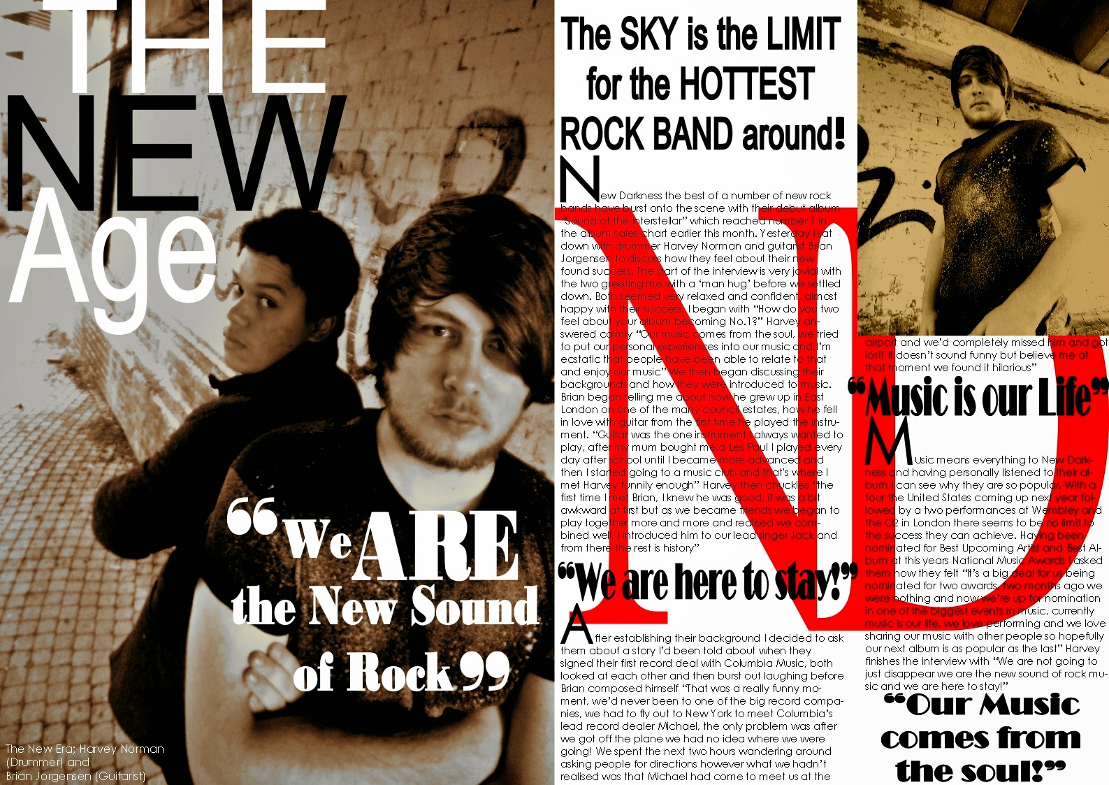
For my double page spread I had a number of photos to choose from, a number of which I felt could have been used in my article but in end I chose to use only one.

In the end I decided to use this picture;
.JPG) I chose this particular picture because I thought that it showed the two band members clearly and made sure they stood out. I liked the colour of the photo as it linked to the slightly darker, more mysterious side of the rock music genre. As well as this I thought that it would combine well with the text and colours that I was going to use in my design. It focuses clearly on the two people and both have the body language and posture that I was looking for.
I chose this particular picture because I thought that it showed the two band members clearly and made sure they stood out. I liked the colour of the photo as it linked to the slightly darker, more mysterious side of the rock music genre. As well as this I thought that it would combine well with the text and colours that I was going to use in my design. It focuses clearly on the two people and both have the body language and posture that I was looking for.
The image itself had good contrast and light levels and was not too overpowering. All in all I thought that this would be the best image to use for my DPS.
For my double page spread I had a number of photos to choose from, a number of which I felt could have been used in my article but in end I chose to use only one.
In the end I decided to use this picture;
The image itself had good contrast and light levels and was not too overpowering. All in all I thought that this would be the best image to use for my DPS.
Double Page Spread
I diverted from my original plan for my DPS as after receiving teacher feedback I added a number of improvements from the original. I felt that the improvements made my DPS look better. The plan that I had to start with was good but I wanted to change a few things that were not included in that plan

Wednesday, 4 March 2015
Music Magazine Photo Selection

Photo Selection Process;
This is the photo that I decided to use for my front cover because I thought it looked striking and would immediately grab members of my target audience. I also chose it because it links to the darker theme of the rock music genre seeing as the image itself is both dark and striking. The image I thought also ticked all the boxes in terms of what I wanted from my photo-shoot, the posture, facial expression and clothing all were correct and combined really well I thought making this photo the best picture to use.Tuesday, 3 March 2015

Thursday, 12 February 2015
Friday, 6 February 2015
Media & Advertising
Class Notes;
Advertising;
- Commercial media producers rely on advertising to make money.
- Advertisers often want to target their products at particular audiences. Magazines will have specific niche markets. Magazine producers attempt to sell readership to the advertisers.
Advertising;
- Commercial media producers rely on advertising to make money.
- Advertisers often want to target their products at particular audiences. Magazines will have specific niche markets. Magazine producers attempt to sell readership to the advertisers.

Thursday, 5 February 2015

REVOLUTION Revenue Prediction
|
Number of pages in Revolution
|
170
|
|
Percentage of Advertising
|
65% (110/170 pages)
|
|
Cover Price
|
£5.99
|
|
Magazine Distribution
|
Monthly Edition
|
|
Advertising Rates
|
£18,000
|
|
Total Advertising Revenue per Magazine
|
110 X £18,000
=£1,980,000 per Magazine
|
|
Yearly Advertising Revenue
|
12 X £1.98
=£23,760,000 yearly revenue
|
|
Magazine sales per month
|
90,000 sold at £5.99
£5.99 X 90,000
= £539,100 made per month
12 X 539,100
=£6,469,200 yearly
|
|
Annual Turnover (Ad rates + Magazine Sales)
|
£23,760,000 + £6,469,200
=£30,229,200 per annum
|
|
|
|
Monday, 2 February 2015
Representations of Men & Women in the Media
Class Notes;
Sex- Biological & physiological characteristics that define men & women.
Gender- Socially constructed roles, behaviours & attributes that society considers appropriate for men & women.
Representation of Men in the Media;
- Strength- physical & intellectual.
- Power.
- Sexual Attractiveness.
- Physique.
- Independence.
- Represented as isolated (Lone Hero) as not needing to rely on others.
- Male physique is becoming a more important part of representation.
Representation of Women;
- Beauty (Within narrow conventions)
- Size/Physique (Narrow conventions)
- Sexuality.
- Emotional.
- Relationships (As opposed to independence/freedom)
- Women represented as being part of a context & working/thinking as part of a team.
- In drama, they tend to take the role of a heroin.
- Passivity extends to victim-hood.
Misogyny- Hatred or dislike of girls/women, sexual discrimination, denigration of women, violence & sexual objectification of women.
Misandry- Hatred or dislike of boys/men, sexual discrimination, denigration of women, violence & sexual objectification of men.
Tuesday, 20 January 2015
Challenges Facing the Media Industry
Challenges Facing the Industry;


Sunday, 18 January 2015
Class Notes; Representations of Age & Sexuality
Representation
of Age in Media
How is Age represented in these Clips?
1) Accused;
Teenager. Fits in with the criminal, violent, drugs, lazy, liar, rebellious
& outlandish stereotypes.
-
Shown as weak & pathetic.
2) Barrister;
Middle Aged. Fits in with the in control, sensible, mature & aggressive
stereotypes.
3) Barrister;
20-30’s, has a softer approach.
Age Stereotypes in the Media;
1) Children; young,
innocent, naïve, pure, sweet, helpless & powerless.
2) Teenagers;
aggressive, moody, lazy, criminals & hate school.
3) 20-30’s; parties,
fun, making money, glamorous & attractive.
4) Middle
Aged; past it, unattractive, uncool, boring, dominant over others
& grumpy.
5) Elderly;
unattractive, slow, weak, ill, confused, pathetic, powerless, not important,
dependant on others.
Sexuality;
Stereotypes;
1) Heterosexual
Male; tough, protector & a leader, higher in society, dominant
figures of state, in their 40’s & in high paying jobs.
2) Heterosexual
Female; weak, girly, feminine, damsel-like & emotional,
subordinate figures.
Stereotypes about homosexuals;
1) All gay men
will die of AID’s.
2) All gay men
are feminine.
3) All gay
women are butch.
4) Gay men
can’t marry nor have children.
5) Homosexual
Male; camp, girly, promiscuous, feminine looking clothes &
loud.
6) Homosexual
Female; Butch, feminist, short hair & hate men.
-
Heterosexuals; monogamous, the ‘norm’, straight
couples have kids etc.
-
Stereotypes are used in TV because they give people
broad views of people’s sexuality.
-
They are used to make TV more interesting & are
most likely found in the genre of TV dramas.
-
60’s- gay was banned so men had to cover up their
homosexuality.
-
In the 50’s homosexuals were sent to asylums to be
‘cured’ of their homosexuality as it was considered a disease.
Friday, 16 January 2015

Tuesday, 13 January 2015

Tuesday, 6 January 2015
Music Magazine Front Cover Analysis
Music
Magazine Front Cover Analysis
Cover
Model/Central Image;

Colour Scheme;
The colour scheme that I used for my cover was a mixture of
white and red. I chose this colour scheme because I thought that they combined
well together to make the text stand out clearer and be more effective at
catching the eye. I put the masthead in a bold red because I wanted the house
name to stand out and be one of the first things the reader notices, this not
only informs them what magazine it is but it is more likely to stay in their
head.
Additionally I made key words such as “Exclusive, You,
Latest” stand out as these are the words that sell the cover lines to the
audience. I want them to be drawn in by an ‘exclusive interview’ so that they
read further into the magazine.
Font;
On the cover of my magazine I included different font sizes
and colours. I did this because I wanted to add variety to the cover and I did
not want it to become repetitive in its style. For example I increased the font
size of the Masthead, Anchorage and key words in the Cover lines, I did this
because I wanted these words and letters to stand out from the page and catch
the reader’s eye. I also changed the colour of the letters at the start of the artist’s
names; I wanted to do this because it makes the cover line appear more
important than it may appear at first. Also I felt that it added some variety
to the text rather than having one block colour all the way through.
Lifestyle Questionnaire Results
Lifestyle Questionnaire Results
I asked 3 people to carry out my lifestyle questionnaire, two girls and one boy and these were the results;
- 2/3 people
said they bought music from ITunes.
-
2/3 said that
they listened to music on the go.
-
2/3 stated
Rock was their main genre of music.
-
2/3 listens
to Rock music regularly.
-
2/3 said they
go to between 6-10 Rock concerts per year.
-
Most of the
participants buy music weekly.
-
Most of the
people listen to daily to music for 4-6 hours.
-
2/3 people
have 1000+ songs on their iPod/music player.
-
Most of them
invest in good quality headphones.
-
All of them
thought the magazine’s cover photo was great.
-
All of the
people stated the colour scheme of the cover was great.
-
2/3 thought
the price of the magazine was not expensive.
Monday, 5 January 2015

Saturday, 3 January 2015
How Magazines Make Money & the Structural Triangle
How Magazines Make MoneyPublishers of magazines earn money from advertisements, subscriptions & the sales generated from newsstands. This is an easy feat for magazines that are known household names. Publications such as "Essence" "Vanity Fair" & "People" have loyal readers because the producers listen to the wants of their audience. Having a good product created their place in the market. These magazines often tell the same story but they are written in such a way that their readers believe they have the insight that the internet or others may not have which keeps their audience coming back for more. The internet has hindered magazine sales but the bigger magazines have adapted and now have websites that work in conjunction with their magazine and offer incentives for purchasing a subscription. Magazines are very expensive to produce, the survival rate is one for every 10 magazines and profits do no turn over for about 3 years.
The Structural TriangleFor my research i looked at two interpretations of the Structural Triangle; one being Maslow's Hierarchy of Needs and the second being the Triangle of Oppression.
Maslow's Hierarchy of Needs;
Maslow wanted to understand what motivates people, he believed that people possess a set of motivation systems unrelated to rewards or unconscious desires. He stated people are motivated to achieve certain needs, when we fulfill each one we move on and seek the next one. When these needs are unmet the desire to fulfill them becomes stronger the longer they are unmet i.e the longer someone goes without food the hungrier they become. We must satisfy the lower basic needs before moving on. Every person has the capability to move up the hierarchy however that progress is often paused by failures such as divorce, loss of a job. These may cause people to fluctuate between levels of the hierarchy.

The Triangle of Oppression;
The Triangle of Oppression enables us to examine our attitudes beliefs and behaviors within asocial context rather than as merely individuals. Those people who do examine their attitudes
beliefs and behaviors in this context are referred to as "allies" in social justice processes.
Anne Bishop, a Canadian educator and.social justice activist, defines allies as people who;
- are personally culturally and structurally aware;
- are connected with.all other people rather than with only their own social groups and not only in a professional or service capacity.
- have a critical analysis of social structures.
- possess a collective orientation as opposed to one that is individualistic.
- have an acceptance of struggle and a sense of process.
- have an understanding of power with as opposed to power over and
have a high degree of self understanding, a knowledge.of history and an understanding
that good intentions do not matter if there is no action against oppression.
As allies to social justice we are dealing with complex personal interaction that is shaped
consciously and unconsciously by cultural norms and structural systems.The Triangle of
Oppression gives us a way to begin engaging ourselves in a social justice.processes.
The Triangle of Oppression enables us to think more critically about the powerful ideas about
difference that exist in society, and that are used to exploit those differences within the systems
of society.

DPS Inspiration
 |
| Q's DPS i really like because of the way they have used colour and font to sculpt the DPS. The colour's are both striking and eye catching and make the text and image stand out. I particularly like the use of the Large Capital J behind the text as it not only links with the artist but also makes a seemingly blank page bright and captivating. I plan to use something similar to this to make my own text stand out as i think the use of it is very good and i think it adds something different to my magazine. |
 |
| This DPS has inspired me because of the way it combines a number of images with a large amount of text to great effect, the pictures do not take up too much room and seem to perfectly compliment the text. The font used for the titles is also very good as it is both very clear and eye catching at the same time. The images seem to surround the text which is unusual, what is also unusual is the amount of images used. Normally this would be too many images but in this particular case i think it works very well as it gives a very personal touch to the article, we are allowed to get up close to the two members of Twin Atlantic which works very well. I think i will use this DPS as my main inspiration as i want to create something outside the box for my DPS and i want to incorporate how the magazine has used a large number of pictures but has not cut down on the amount of text. I think it is a good DPS to use as an inspiration for my magazine. |
Subscribe to:
Comments (Atom)